
Exterior House Letters may seem like a small detail, but they can change the whole look of your home. They do more than show a name or address. They help visitors find your house, support curb appeal, and create a strong first impression before anyone even reaches the front door. The right choice can make your home feel more polished, more modern, or more timeless.
If you are choosing house number letters or outdoor address letters, it helps to think beyond style alone. You want letters that look good, fit your home, and hold up in the weather. You also want them to be easy to read from the street.
Why Exterior House Letters Matter for Your Home
Exterior lettering is one of those details people notice even when they do not realize it. A clean set of wall-mounted address signs can make a home look more organized and cared for. On the other hand, faded, too-small, or poorly placed letters can make a house feel unfinished.
They improve curb appeal
Curb appeal is the first visual impression your home gives. Decorative house letters help shape that impression. When they match the style of your home, they make the entire front exterior feel more thoughtful and complete.
They help people find your home
This is a practical benefit, but an important one. Delivery drivers, guests, service workers, and emergency responders all need to quickly identify your home. Clear outdoor address letters make that easier.
They reflect your personal style
Your home should feel like yours. The lettering you choose can say a lot about your taste. A sleek modern set can feel sharp and minimal. A classic serif style can feel elegant. Rustic metal letters can give the home a warm farmhouse feel.
They create a polished finish
The right Exterior House Letters can make a simple exterior look more refined. Even if you are not making major renovations, a strong design choice like this can help everything feel more complete.
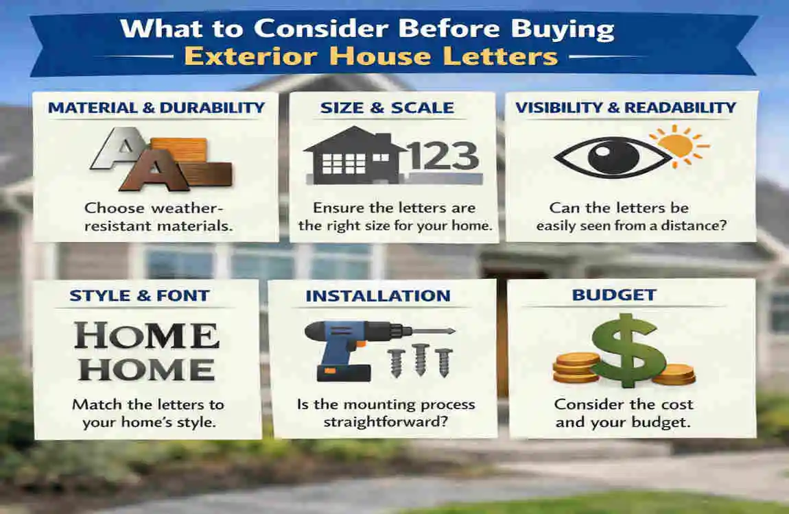
What to Consider Before Buying Exterior House Letters
Before you buy, take a step back and think about the big picture. The best choice is not always the one that looks best in a photo. It is the one that works for your home, your climate, and your needs.
Think about your home’s architecture
Your house style should guide your choice. A modern home and a colonial home usually need very different lettering styles. If you match the letters to the architecture, the result looks intentional.
Think about viewing distance
How far away will people be when they try to read the letters? A home set back from the road needs larger lettering than one with a close front walk.
Think about climate
Weather matters more than many buyers expect. A material that works well in a dry area may not hold up in humidity, salt air, or freezing weather.
Think about budget
There are good options at different price points. Still, cheap letters may fade, rust, peel, or loosen over time. It is often smarter to spend a little more on something that lasts.
Think about the surface
Not every installation surface works the same way. Brick, stucco, wood, vinyl siding, and concrete all need different mounting methods. You want modern exterior lettering that fits the wall and the home.
The best results usually come from balancing aesthetics and functionality. The letters should look good, be readable, durable, and easy to install.
Match the Letters to Your Home’s Architectural Style
One of the easiest ways to make your home look better is to choose lettering that suits its style. When Exterior House Letters match the architecture, they feel like part of the design instead of an afterthought.
Modern homes
Modern homes usually look best with clean, simple lettering. Think sans-serif fonts, straight lines, bold shapes, and enough spacing to keep the design open.
Modern homes often work well with:
- Minimalist metal letters
- Matte black finishes
- Thin or geometric shapes
- Strong contrast against light walls
The goal is to keep the look sharp and uncluttered.
Traditional homes
Traditional homes often pair well with more classic lettering. That may include serif fonts, elegant curves, or timeless finishes like bronze or brushed metal.
This style usually feels best when the letters are:
- Balanced and refined
- Easy to read
- Slightly decorative without being too ornate
Traditional exteriors often benefit from a look that feels graceful and established.
Farmhouse homes
Farmhouse style often leans warm, welcoming, and simple. Rustic or vintage-inspired decorative house letters can work beautifully here. Matte black, iron-like finishes, and slightly weathered looks are popular choices.
Farmhouse-friendly options often include:
- Clean but rustic shapes
- Black or dark bronze tones
- Metal or wood-look finishes
- Simple layouts that feel relaxed
The best farmhouse letters feel charming, not busy.
Coastal homes
Coastal homes usually look best with light, airy designs. The lettering should feel fresh and easygoing. Because coastal environments can be harsh on materials, weatherproof house letters are especially important here.
Good coastal choices often include:
- Corrosion-resistant metals
- Soft finishes
- Light colors or crisp contrast
- Simple, elegant shapes
If you live near the water, appearance matters, but durability matters even more.
Industrial homes
Industrial-style homes often suit stronger shapes and raw finishes. Think metal, exposed textures, and bold forms. The look should feel intentional and slightly edgy.
Good industrial lettering often includes:
- Strong, blocky fonts
- Raw metal or brushed finishes
- Dark tones
- Clean mounting hardware
Keep the whole exterior consistent
Your letters should work with your front door, trim, light fixtures, and mailbox. If your house has black hardware, black letters may look right at home. If your trim is soft white and your door has brass details, a warm metal finish might fit better.
Your Exterior House Letters should look like they belong there. That is the real goal.
Choose the Right Material for Durability and Appearance
Material is one of the most important decisions you will make. It affects how the lettering looks, how long it lasts, and how much care it needs. Some materials are stylish but delicate. Others are strong and low-maintenance.
Compare common material options
Here is a simple overview of the most common choices:
Material Appearance Durability Maintenance Best For
Metal Modern, strong, premium High Low to moderate Most climates, clean modern looks
Acrylic Sleek, lightweight, versatile Moderate Low Contemporary homes, lighter installations
Wood Warm, natural, inviting Moderate to low Higher Rustic or farmhouse styles in mild climates
Plastic/Composite Simple, budget-friendly Moderate Low Cost-conscious buyers, temporary use
Brass Classic, rich, elegant High Moderate Traditional homes, upscale finishes
Aluminum Lightweight, weather-resistant High Low Humid or rainy areas
Stainless Steel Clean, durable, modern Very high Low Coastal, wet, or demanding climates
Metal: durable and modern
Metal is one of the most popular options for metal house letters because it looks clean and lasts well. It can handle outdoor conditions better than many other materials. Depending on the finish, metal can look bold, elegant, or understated.
Pros:
- Strong and durable
- Often weather-resistant
- Works well in modern and industrial styles
- Offers a premium look
Cons:
- Can cost more than plastic
- Some metals may need special coatings
- Heavier than acrylic or plastic
If you want a long-lasting and polished look, metal is often a smart choice.
Acrylic: sleek and versatile
Acrylic is lightweight and can look very clean. It is a good option when you want a modern look without a heavy piece on your wall. It also comes in many colors and finishes.
Pros:
- Lightweight
- Smooth and modern home
- Versatile design options
- Often easier to install
Cons:
- Less premium than metal
- Can be more vulnerable to scratches
- May not age as gracefully in harsh sun
Acrylic can work well if the area is somewhat protected and you want a crisp look.
Wood: warm but higher maintenance
Wood brings warmth and a natural feeling. It can look beautiful on a farmhouse or rustic home, especially when paired with a matte finish. But wood usually needs more care than metal or acrylic.
Pros:
- Natural and welcoming
- Beautiful for rustic styles
- Easy to customize
Cons:
- Can warp, crack, or fade
- Needs sealing or protection
- Not ideal for wet or harsh climates
If you love wood, make sure it is treated properly for outdoor use.
Plastic and composite: budget-friendly choices
Plastic and composite materials are often the most affordable. They are lightweight and easy to install. For some buyers, they offer a good short-term or budget-conscious solution.
Pros:
- Lower cost
- Lightweight
- Easy to mount
- Available in many styles
Cons:
- Usually less premium in appearance
- May fade faster
- Can be less durable over time
If you are looking for a simple, affordable option, these can work, but quality varies widely.
Premium metals: brass, aluminum, and stainless steel
These materials are often chosen for long-term value and better finish quality. They each have their own strengths.
- Brass feels rich and classic. It works well for traditional homes.
- Aluminum is light, durable, and good in humid or rainy areas.
- Stainless steel is one of the toughest choices and is often a great fit for coastal or harsh climates.
Think about climate before buying
Climate can make or break your choice of weatherproof house letters.
- Humid areas: Look for materials that resist moisture and corrosion.
- Coastal salt air: Choose corrosion-resistant metals like stainless steel or specially coated aluminum.
- Heavy rain: Make sure the finish and mounting hardware are designed for wet conditions.
- Intense sunlight: Look for UV-resistant finishes to prevent color from fading quickly.
- Freezing temperatures: Choose materials that will not crack, warp, or loosen in cold weather.
If you want your lettering to last, do not choose based on looks alone. Choose based on the weather too.
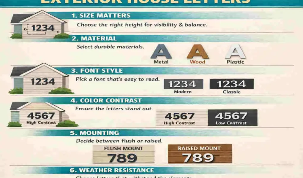
Pick the Best Size for Visibility and Curb Appeal
Size matters more than many people think. If the letters are too small, they disappear. If they are too large, they can overwhelm the front of the house.
Why size affects readability
Your house number letters need to be seen quickly. People should be able to read them from the street, from the sidewalk, or from the driveway without straining.
Why size affects design balance
The lettering should fit the scale of the home. A large wall can handle bigger letters. A narrow entryway may look better with a more modest size. The letters should support the design, not fight against it.
What to think about before choosing size
Here are the main factors to keep in mind:
- Distance from the road: The farther the home sits back, the larger the letters usually need to be.
- Size of the wall or surface: A small wall cannot hold oversized lettering well.
- Height of mounting: Letters placed higher up may need to be larger for easy reading.
- Length of the address or name: Longer wording may require smaller letters or wider spacing.
General sizing guidance
A good rule of thumb is simple:
- Choose larger letters if your home is set farther from the street.
- Choose smaller, refined letters if viewers will see them up close.
You do not want the letters to shout for attention. You want them to be visible, balanced, and easy to understand.
Make sure the size fits the home
A set of Exterior House Letters should be noticeable without overpowering the façade. When size is right, the letters feel like a natural part of the exterior. That is when they look best.
Decide on the Best Finish and Color
Finish and color affect how the letters look in the daylight, how easy they are to read, and how well they match the rest of the home.
Popular finish options
Matte
Matte finishes are soft and subtle. They do not reflect much light, making them ideal for modern, understated designs.
Glossy
Glossy finishes feel brighter and more reflective. They can stand out more, but they may also create glare in direct sunlight.
Brushed metal
Brushed finishes have a textured look that adds depth without being too shiny. They often work well in contemporary, industrial, or upscale settings.
Polished
Polished finishes are more reflective and eye-catching. They can look elegant, but they also show fingerprints and reflections more easily.
Powder-coated
Powder-coated finishes are popular because they are durable and available in many colors. They often hold up well outdoors.
Popular color choices
The most common colors include:
- Black: Bold, clean, and easy to read
- White: Fresh and simple, especially on darker walls
- Bronze: Warm and classic
- Gold: Elegant and decorative
- Silver: Modern and clean
- Custom colors: Great for matching trim or branding your exterior style
Use contrast to improve readability
Contrast is one of the easiest ways to make Exterior House Letters more visible.
- Dark letters on light walls work very well.
- Light letters on dark siding also work well.
If the letter color blends too much with the wall, the lettering may look nice but be hard to read. That is a problem you want to avoid.
Match other exterior details
It helps if the letters connect visually with other parts of the home, such as:
- Front door hardware
- House trim
- Mailbox finish
- Light fixtures
That does not mean everything must match exactly. It just needs to feel coordinated.
Consider Placement for Maximum Impact
Where you place the lettering can matter just as much as what you buy. Good placement helps your home look organized and makes the address easier to spot.
Common placement locations
Front façade
This is one of the most common choices. It is highly visible and often works well with modern and traditional homes.
Near the entry door
Placing the letters near the front door creates a welcoming focal point.
Porch column
This can be a smart choice if you want the letters to stand out without overwhelming the main wall.
Gate or fence
If your home sits back from the street, a gate or fence location can help visitors identify the property sooner.
Garage wall
Garage placement works well when the garage faces the street and has enough open surface area.
Best placement practices
To make the design look clean and intentional, follow these simple tips:
- Keep the letters centered and level
- Avoid cluttered backgrounds
- Maintain proper spacing between each letter
- Position them at eye level when possible
If the background is too busy, the letters can get lost. A clean wall is often the best backdrop.
Think about rules and visibility
In some areas, local regulations or HOA rules may affect size, placement, or style. It is always smart to check before installing. You should also think about emergency visibility. A clearly placed address can help first responders find your home quickly.
Good placement is about both beauty and usefulness.
Choose a Mounting Method That Fits Your Surface
Even the best-looking letters can fail if they are mounted the wrong way. The mounting method should match the wall material and the product design.
Common mounting methods
Stud mount
Stud mounts are a strong choice and often used for heavier metal letters. The letters attach to the wall with small posts or studs.
Best for: brick, concrete, stucco, and other solid surfaces
Flush mount
Flush mounting keeps the letters close to the wall for a neat look. It is a simple, clean style that works well when you want a lower-profile finish.
Best for: many smooth surfaces and minimalist designs
Adhesive mount
Adhesive mounting is simple and fast, but it is usually better for lighter letters and smoother surfaces.
Best for: some wood, metal, or smooth siding applications
Spacer mount
Spacer mounts create a small gap between the letters and the wall. This adds depth and shadow, making the design more striking.
Best for: modern and decorative lettering
Match the method to the surface
Different surfaces need different approaches:
- Brick: Stud mount is often a strong option.
- Wood: Adhesive or screws may work depending on the product.
- Stucco: Use the correct hardware to avoid cracking or damage.
- Vinyl siding: Be careful not to damage the siding; lightweight methods may be best.
- Concrete: Strong anchors or studs are often needed.
Do not overlook installation details
Wrong installation can damage the wall or reduce durability. It can also make the letters look crooked or loose over time. Before buying, check whether the product includes:
- A template
- Mounting hardware
- Clear instructions
A product that is easier to install often saves time and frustration later.
Prioritize Weather Resistance and Low Maintenance
Outdoor products need to perform in real weather, not just look good in a photo. That is why weatherproof house letters are such a smart investment.
Weather resistance features to look for
Rust resistance
This is especially important for metal lettering. Rust can ruin both appearance and lifespan.
UV protection
Sunlight can fade color and weaken finishes over time. UV protection helps reduce that damage.
Waterproof seals
If water gets into the material or mounting points, it can cause staining, swelling, or loosening.
Fade resistance
Letters that fade quickly lose their visual impact. This matters a lot for bold, colored, or coated pieces.
Corrosion-proof coatings
These are especially useful in humid or salty environments. They help the lettering stay attractive longer.
Easy maintenance matters too
A good product should not require much care. Basic upkeep is usually enough.
Here are simple maintenance habits:
- Wipe letters with a soft cloth
- Avoid harsh chemicals
- Inspect mounting hardware from time to time
Seasonal care is smart
After storms, extreme heat, or winter weather, take a quick look at the letters. If anything is loose, damaged, or dirty, handle it early. Small issues are easier to fix before they become bigger problems.
The best Exterior House Letters combine beauty, durability, and easy care. That is the ideal balance.
Set a Budget Without Sacrificing Quality
Price matters, but value matters more. A very cheap option may need to be replaced sooner, which can cost more in the long run.
What affects the price
Several factors can raise or lower the cost:
- Premium materials
- Custom design
- Special finishes
- Installation complexity
- Size and thickness
- Weather-resistant coatings
Think in terms of long-term value
When you buy better-quality modern exterior lettering, you often pay for longer life, a better appearance, and less maintenance. That can save money later because you are less likely to replace it soon.
A simple budgeting mindset
Instead of asking, “What is the cheapest option?” ask:
- Will this look good on my home?
- Will it hold up in my climate?
- Will it still look good in a few years?
That approach usually leads to a better purchase.
Common Mistakes to Avoid When Choosing Exterior House Letters
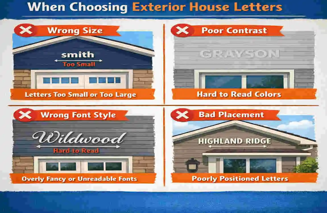
Many buyers make the same mistakes. The good news is that they are easy to avoid once you know what to watch for.
Choosing letters that are too small
Small letters may look fine online but disappear once installed. If people cannot read them from the street, the design is not doing its job.
Picking a style that clashes with the home
A style that looks beautiful on its own may not work with your architecture. If the home is traditional, very sharp modern lettering may feel out of place.
Ignoring climate conditions
If you live in a humid or coastal area, the wrong material can rust, warp, or fade quickly. Climate should always be part of the decision.
Overlooking mounting requirements
A product may look great but be hard to install on your wall type. Always check the mounting method before buying.
Selecting low-quality materials
Low-cost materials often wear out faster. That can mean replacement, extra labor, and a less attractive exterior.
Using poor color contrast
If the letters do not stand out from the wall, they lose readability. Good contrast is not optional; it is essential.
Think of this section as a quick checklist before you commit. A few smart choices now can save you a lot of regret later.
How to Maintain Exterior House Letters for Long-Lasting Appeal
Once your lettering is installed, a little care goes a long way. Maintenance keeps the pieces clean, readable, and secure.
Simple care tips
- Dust and clean the letters regularly
- Check for loose hardware
- Touch up finishes if needed
- Inspect after storms or strong weather
Material matters here too
Maintenance needs vary by material. Metal may need occasional cleaning. Wood may need more protection. Acrylic may need gentle care to avoid scratches.
If you keep up with small tasks, your Exterior House Letters will stay attractive much longer. That helps preserve curb appeal and keeps the front of your home looking cared for.
Frequently Asked Questions About Exterior House Letters
What are the best materials for exterior house letters?
The best materials are usually metal, aluminum, stainless steel, and some coated composites. These options tend to last longer outdoors and resist weather better than many cheaper materials.
How big should exterior house letters be?
The right size depends on how far your house sits from the road, how large the wall is, and how high the letters will be mounted. In general, homes farther from the street need larger letters for better visibility.
Where should house letters be placed for best visibility?
The best place is usually the front façade, near the entry, or another clear open area with strong contrast. The letters should be easy to see without competing with too many other design elements.
Are metal exterior house letters better than plastic ones?
In most cases, yes. Metal house letters usually offer better durability, a more premium look, and stronger weather resistance. Plastic can be budget-friendly, but it often does not last as long or look as refined.
How do I choose a style that matches my home?
Look at your home’s architecture, trim, door hardware, and exterior colors. Modern homes usually look best with clean, simple lettering. Traditional homes often suit classic serif styles. Farmhouse and coastal homes usually do well with softer, more relaxed designs.
| Factor | What to Look For | Why It Matters |
|---|---|---|
| Style | Match your home’s architecture | Creates a cohesive, polished look |
| Material | Metal, acrylic, wood, or composite | Affects durability and appearance |
| Size | Large enough to read from the street | Improves visibility and curb appeal |
| Finish/Color | High-contrast, weather-safe colors | Helps letters stand out clearly |
| Placement | Front façade, door area, or gate | Boosts visibility and design balance |
| Mounting Method | Compatible with your wall surface | Ensures secure, damage-free installation |
| Weather Resistance | Rust-proof, UV-resistant, waterproof | Keeps letters looking good longer |
| Budget | Balance cost with quality | Helps you get the best long-term value |