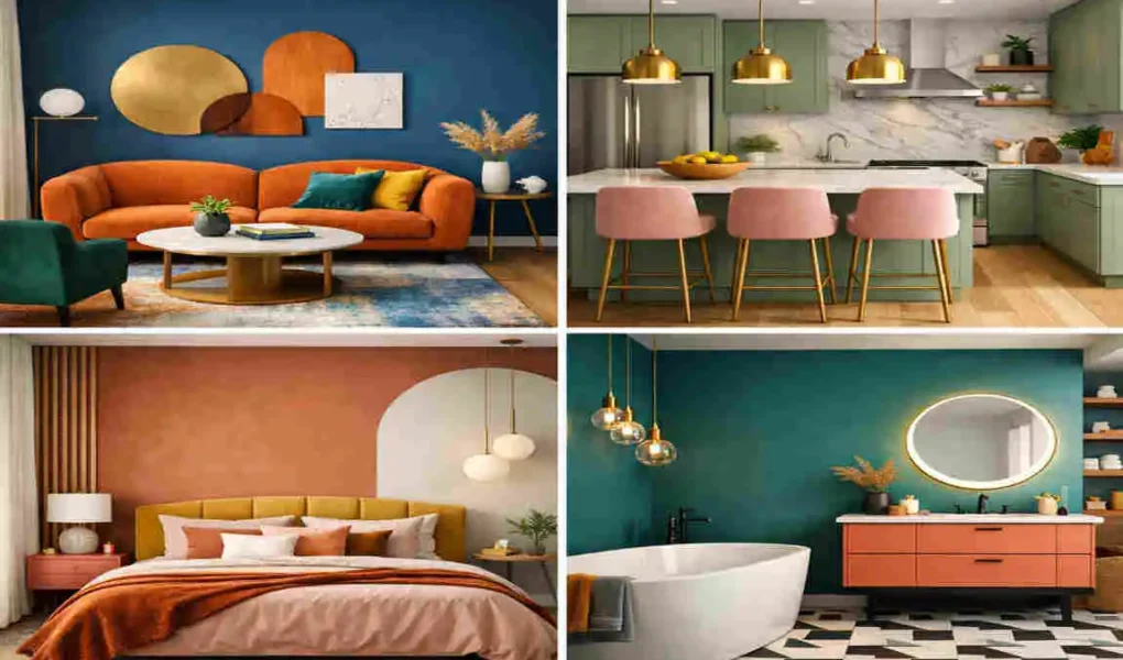
Colour house interior design is all about using the right shades to shape how your home looks and feels. Colour does more than decorate a room. It can make a space feel calm, bright, warm, large, or cozy.
That is why colour is one of the most important parts of interior decorating. The colours you choose affect your mood, your comfort, and even how people view your home.
Why Colour House Interior Design Matters
Creates the Right Atmosphere
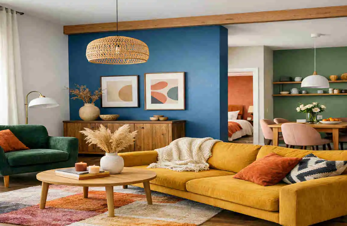
Colour sets the mood of a room right away. Warm shades like red, orange, and yellow can make a room feel lively and active. Cool shades like blue and green can make it feel calm and restful.
When you pick colours with purpose, you help each room serve its intended purpose. A kitchen may feel better with a bright tone, while a bedroom may feel better with a soft one.
Makes Rooms Feel Larger or Smaller
Light shades can make a room look open and airy. Dark shades can make a room feel smaller, deeper, and more intimate.
This is useful when you are decorating small spaces. If you want a room to feel bigger, light colours are usually the better choice.
Reflects Your Personal Style
Your colour choices show your taste. A modern home may use clean whites and greys. A traditional home may use warmer, richer shades. A minimalist space may rely on soft neutrals.
The right palette helps your home feel like your home.
Understanding Colour Psychology
Warm Colors
Warm colours include red, orange, and yellow. These colours feel energetic, welcoming, and bold.
Red can add drama. Orange feels cheerful. Yellow brings brightness and warmth. Use these colours carefully so they do not overwhelm the room.
Cool Colors
Cool colours include blue, green, and purple. These shades usually feel peaceful and refreshing.
Blue is often used in bedrooms because it feels calm. Green gives a natural, soothing look. Purple can feel soft, creative, or elegant.
Neutral Colors
Neutral colours like white, grey, beige, and black are versatile and easy to match.
White makes rooms feel clean and open. Grey feels modern. Beige adds warmth. Black gives contrast and a touch of luxury.
Colour Mood Best Room
White Fresh & Clean Living Room
Blue Calm Bedroom
Green Relaxing Office
Yellow Cheerful Kitchen
Grey Modern Dining Room
Beige Warm Family Room
Black Luxury Accent Walls
Best Colour House Interior Design Ideas by Room
Living Room Colours
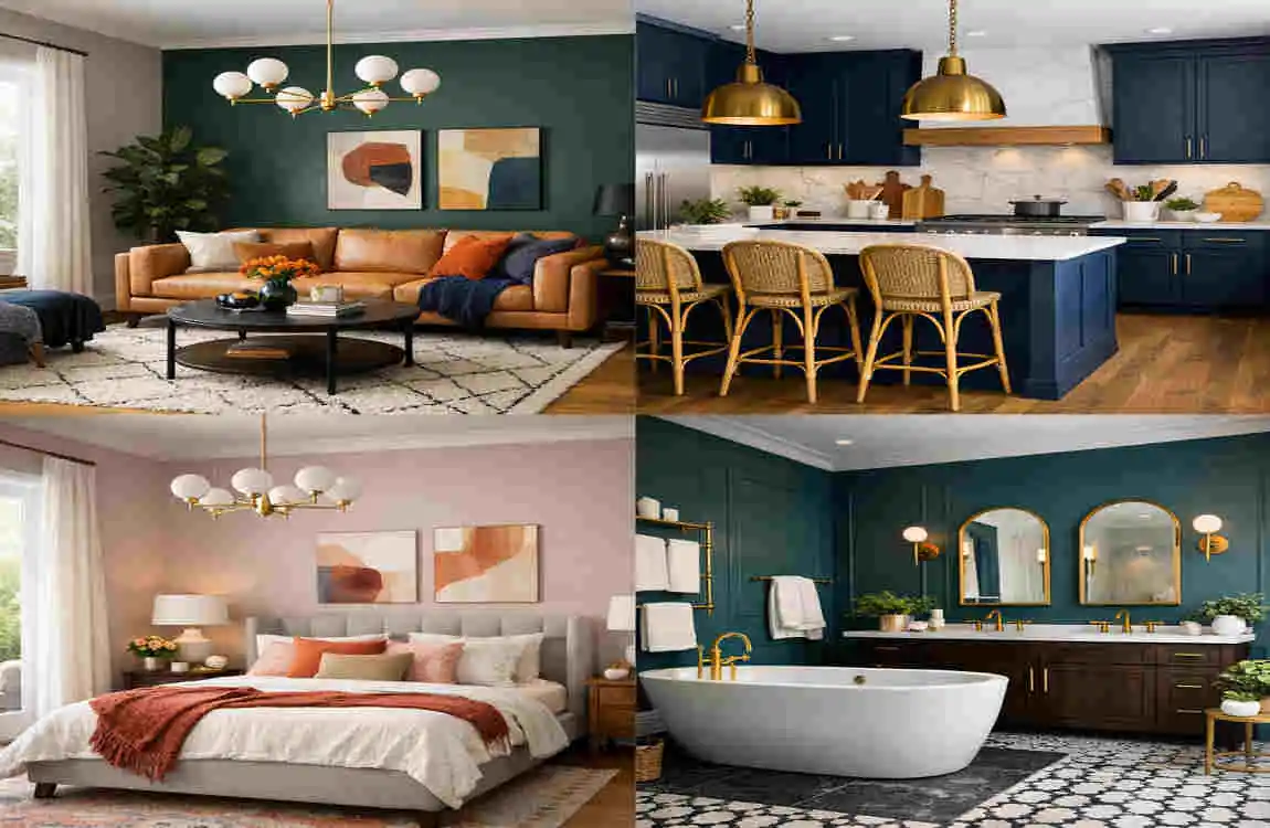
The living room is where people gather, so the colour should feel welcoming. White and beige create a soft and open look. Grey with wooden accents gives a modern but warm feeling. Earth tones like sand, clay, and soft brown make the space cozy.
If you want a room that feels friendly and easy to live in, these shades are a safe and stylish choice.
Bedroom Colors
Bedrooms work best with calm colours. Soft blue, sage green, and lavender can help create a peaceful mood. Warm neutrals like cream and taupe also work well if you want something simple and restful.
Try to keep bedroom colours soft so the room feels like a place to relax.
Kitchen Colors
Kitchens often look best in fresh, clean shades. White cabinets are always popular because they make the room feel bright. Navy blue adds depth and style. Olive green gives a natural, modern touch. Soft cream keeps the room warm without feeling heavy.
You can also mix two colours for a more interesting look. For example, white cabinets with a dark island can look beautiful and balanced.
Dining Room Colours
Dining rooms can handle deeper shades. Deep green, charcoal grey, and warm beige all work well here.
These colours create a more polished feeling and help the room feel special. They also pair nicely with wood furniture and soft lighting.
Bathroom Colors
Bathrooms should feel fresh and clean. White, aqua blue, and light grey are all smart choices.
White helps the room look open. Aqua adds a spa-like feel. Light grey gives a calm, modern look.
Home Office Colours
A home office needs colours that help you focus. Green, blue, and neutral grey are all great options.
Green feels steady and easy on the eyes. Blue helps create a quiet, focused mood. Grey keeps the space simple and professional.
Trending Interior Colour Combinations
White and Wood
This combination is timeless. White keeps things bright, while wood adds warmth and natural texture.
It works well in almost any room.
Grey and Navy
Grey and navy create a smart, modern look. This pair feels strong but not too loud.
It works especially well in living rooms, offices, and bedrooms.
Black and White
Black and white is a classic high-contrast style. It feels clean, bold, and elegant.
Use black carefully so the room does not feel too dark.
Beige and Olive Green
This pairing feels calm, earthy, and welcoming. Beige softens the look, while olive green adds character.
It is a great choice for family rooms and living areas.
Cream and Gold
Cream and gold create a soft, elegant feel. This is a good choice if you want a warm and polished room.
Sage Green and White
This combination feels fresh and peaceful. Sage green adds colour without being too strong, and white keeps everything bright.
How to Choose the Right Colour Palette
Consider Natural Lighting
Light changes how colours look. A colour that feels soft in one room may look much darker in another.
Always check your room in daylight and at night before making a final choice.
Match Flooring and Furniture
Your wall colours should work with your floors, cabinets, and furniture. A good palette brings everything together.
If your furniture is dark, lighter walls can help balance the room. If your furniture is light, deeper wall colours may add contrast.
Follow the 60-30-10 Rule.
This simple Rule helps you build a balanced room.
- 60% main color
- 30% secondary color
- 10% accent color
This keeps the space from feeling too busy.
Test Paint Samples
Never choose a paint colour from a small picture alone. Try samples on the wall first.
Look at them during the day and at night. This helps you see the true colour.
Coordinate the Whole House
Your home should feel connected. That does not mean every room must be the same colour, but the colours should flow well from one room to the next.
A consistent palette makes the whole house feel more polished.
Common Colour Design Mistakes to Avoid
Using Too Many Colours
Too many colours can make a home feel messy. Stick to a simple palette for a cleaner look.
Ignoring Lighting
Lighting changes everything. A colour that looks great under store lights may look different in your home.
Choosing Trends Over Lifestyle
Trendy colours can be fun, but they may not suit your daily life. Choose colours you will enjoy for a long time.
Forgetting Ceiling and Trim Colours
People often focus only on walls. But ceilings, trim, and doors also affect the final look.
Skipping Paint Samples
This is a common mistake. Testing paint first helps you avoid costly changes later.
Expert Tips for Beautiful Colour House Interior Design
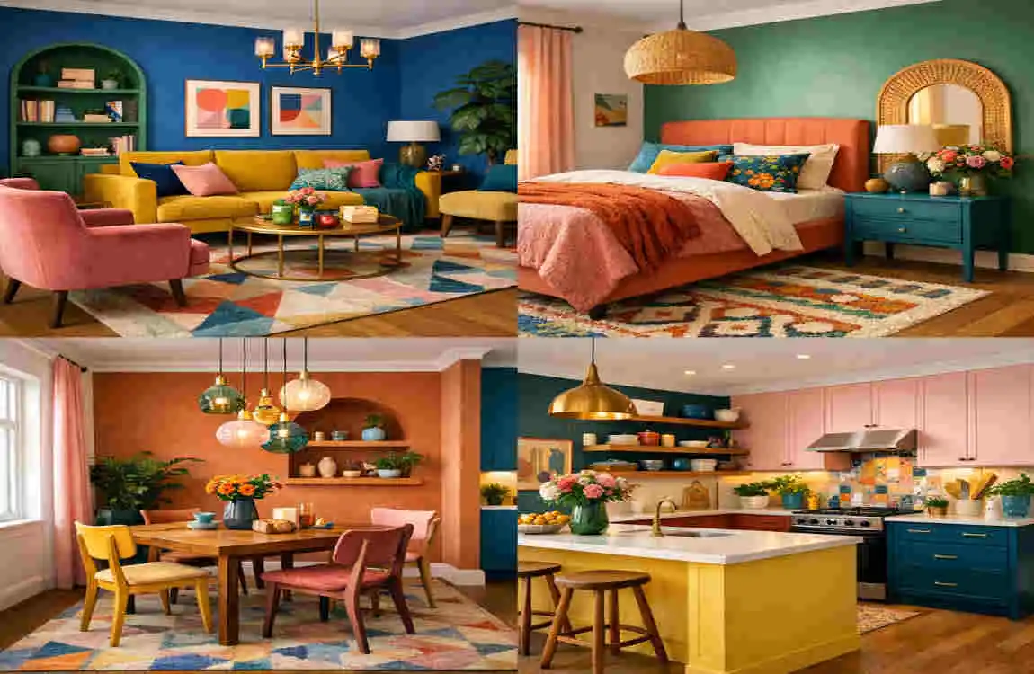
- Use accent walls carefully
- Add texture with rugs and fabrics
- Balance bold colours with neutrals
- Keep adjoining rooms visually connected
- Refresh spaces with accessories instead of repainting
These small choices can make a big difference. Sometimes, a few pillows, curtains, or wall pieces are enough to update a luxury room without changing everything.
Frequently Asked Questions
What is the best colour house interior design for modern homes?
Modern homes often look best with clean neutrals like white, grey, beige, and black, along with simple accent colours.
Which interior colours make a room look bigger?
Light colours like white, soft grey, cream, and pale blue usually make rooms look larger and brighter.
How do I choose colours for my whole house?
Start with one main palette, then use related shades in each room so the home feels connected.
What are the most popular interior paint colours?
White, grey, beige, blue, and soft green are among the most popular choices.
Should every room have the same colour palette?
Not exactly. Each room can be different, but the colours should still work well together.
How often should I update interior colours?
You do not need to repaint often. Many people refresh colours only when styles change, or the room starts to feel dull.
Which colours increase home value?
Neutral, widely liked colours such as white, grey, and beige often appeal to buyers.
What is the 60-30-10 colour rule?
It means using 60% of the main colour, 30% of the secondary colour, and 10% of the accent colour for a balanced design.
| Aspect | Details |
|---|---|
| Topic | Modern color house interior design for every room |
| Purpose | Create a stylish, comfortable, and visually balanced home using color |
| Living Room Colors | Soft white, warm beige, greige, sage green, and light gray for a welcoming feel |
| Kitchen Colors | White, navy blue, olive green, charcoal, or light wood tones for a clean modern look |
| Bedroom Colors | Dusty blue, soft green, lavender, taupe, and warm gray for relaxation |
| Bathroom Colors | Crisp white, light blue, seafoam green, and marble-inspired neutrals for a fresh appearance |
| Dining Room Colors | Deep green, terracotta, navy, or warm earth tones to create an inviting atmosphere |
| Home Office Colors | Soft gray, muted blue, forest green, and beige to improve focus and productivity |
| Trending Color Palette | Earthy neutrals, warm whites, olive green, muted blues, clay tones, and charcoal accents |
| Accent Colors | Mustard yellow, burnt orange, black, gold, emerald green, and navy blue |